1. there is significant user-error at play (the pdfs i made had text much, MUCH too small to read)...

this earring card is barely usable. that small line of text is not readable, but it only says "limited edition and one-of-a-kind".

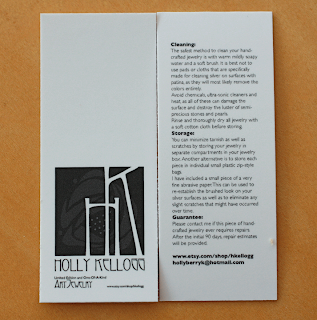
this carecard/hangtag is completely and utterly unusable. the care text is too small to see, as is the contact information.
i take full responsibility for not having the exact dimensions of the mini-card nearby, so i could have understood exactly how tiny it would be. i DO wish there was a human involved in the process who could have shot me an email before they printed these bad-boys up; but i do know that it is ultimately my own fault.
and ALSO...
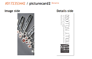
2. i really think there's a fault in their template design.
this is a screenshot of how i set up the 2 sides within their template..

and this is what i got...

i assumed that the 2 right edges were a common edge (the bottom), so that when you flip the card on a vertical axis the image and text would be right side up. instead, they're opposite...so when you're looking at the image side of the card above and flip it vertically, the text is upside down like that. that just doesn't seem right.
it's not like they're unusable, but they annoy the hoo-ha out of me.
p.s. the tiny text at the top is only BARELY readable. duh.
2 comments:
aw, damn. they look gorgeous, if teeny tiny...
Arrgh! Couldn't they have given you a proof to look at or asked if all of your customers were eye doctors? Bummer to hear this was not good. I wonder if they would redo them at a discount? That tiny print is very tiny. Damn!
xoxo
Post a Comment